The best bit is the anecdote about LCARS in Star Trek: The Next Generation. It was all due to a budget shortfall:
"Star Trek also may have helped create the entire image-under-glass paradigm that governs our digital world. The interface, known as LCARS, is cool-looking. It’s distinctive. And it’s actually the result of a budget shortfall.
Star Trek: The Next Generation didn’t have as much money for set design as did the original series, which had panels wired with jewels and glowing buttons. Instead, they cut out film and put them over glass panes."
It's usually constraints, not the lack of them, that give birth to true innovation.
Another thing: the original Star Trek brought the very concept of teleportation into mainstream attention and it was also due to a budgeting issue - they didn't have money to shoot sequences of Enterprise landing or sending shuttles down to the planet, so they invented a workaround...
It reminds me of The Lean Startup where IMVU couldn't roll out walking animation quickly enough, so they had avatars teleport and users thought it was more advanced than second life and the sims. Got to love work around a that really work
Doctor Who beat them to that same solution some years before.
I'm not entirely sure, but the first show I remember having the budget to show the characters actually taking ships to their destination each time was Space: 1999, where the "Eagle" shuttles were ubiquitous. (It beat Battlestar Galactica by a few years.)
Space 1999 was preceded by UFO, made by (more or less) the same production company.
There was no teleportation - but there were ships flying a regular run to and from a moon base.
UFO is unbelievably good considering it was made in 1970. It's of its time socially, ahead of its time visually, and a lot of the scripts still stand up as excellent imaginative TV writing.
That's true; but Space: 1999 did it every episode. Most transportation in UFO via. that futuristic car, which they had a full-scale working example of.
I'm sure they showed the moon shuttle a few times, and of course they did lots of effects for the fighter jets and submarines blowing UFOs up, but it wasn't ubiquitous like in Space: 1999.
Didn't Babylon 5 have frequent CG sequences relating to ships docking and even landing on planets? (Granted they probably reused, maybe from different angles and with small changes, a lot of those sets).
The LCARS display has a special place in my family. A few years back, my wife had a follow-up interview that landed on Halloween at Ubisoft. She was informed, "Don't be surprised if people are in costume and you should consider it too, if you feel so inclined."
She slapped on a TNG Combadge and re-designed her resume to look like a LCARS display and said, "Hey, it worked for their production when they were in a pinch." She accepted an offer a few days later.
The thing is: whenever you see it on-screen, the people using it are happy with it, not frustrated, not fighting it, and that is truly "good UX" (within the suspension of disbelief of the show).
In other words: it shows that, if people react to a UI like they do in the show, that's the perfect UI.
But that's just the point. If you have real-world users reacting to your real-world interface in the same way that TNG's scripted users (generally) react to their prop interface, you're probably doing something right.
Viz magazine (http://viz.co.uk/) recently did a strip wherein a thinly-disguised Enterprise and crew are obliged to beam up Captain Thomas T. Cook and his landing party in the face of danger, but his messages requesting help come through via email to Outlook Express...
They have had full natural language AI in every Star Trek franchise - except maybe the Scott Bakula one ( Enterprise? ) which I didn't watch . So I'd think updates would be largely a solved problem. Heck, the computer might patch itself.
Overlapping windows in a cascade (so the bottom left corners act a bit like a tab selector) are my preferred window layout.
Random overlapping doesn't work particularly well. Any time you have to manage the z-index of more than one window, something has gone wrong. Thus cascading.
I can't stand tiling though. Either everything is too small, or you can't get enough stuff on screen at once.
For me overlapping windows are better for using two applications at the same time - copy pasting, drag and dropping between them etc. This is because their position is deterministic. Tabs are better when I have a boatload of unrelated pages (e.g.: tabs). This is also why I find tabbed interfaces in code editors useless.
I find tabbed editors useful in that they allow you to open the current "working set" of files, and then disregard the rest of the project files. After I open up the working set, I usually close the tree view (Sublime, in my case) so my code has more room.
For example, I don't run my browser maximized, because I don't want web pages in landscape; acres of margin or very long lines - neither choice is good. The viewport of my browser is nearly square (1500 x 1300).
Terminals don't work great with very long lines either; man, less etc. adjust to terminal width making lines harder to read.
My scratchpad app I keep for notes is generally notepad shaped, i.e. taller than it is wide, but not as wide as a terminal window.
My password manager (KeePass2) is the only other really common app. I don't interact with it very often other than via hotkey.
I use KWin, and it has configurable keyboard shortcuts for basically everything, so I have ones configured to effectively tile windows into halves or corners of the screen. This makes very good use of 16:9 monitors.
But sometimes an overlapping window is very useful. For example, I'm watching a fullscreen video, but I want to chat with a friend in an instant messaging app. I can put the conversation window on top of the video in a corner of the screen where it doesn't block anything important.
Or I'm doing some kind of graphical work, image editing, web design, etc, and I only need to see part of a window, but it needs to fill the height of the screen. I can put other programs on top of the parts I don't need to see.
Tiling is great, but overlapping windows have their place too.
Overlapping windows are wonderful in X-mouse style mode.
When your soul interaction with a normally large window is just a tiny strip on the bottom, it's like you've divided a single display in to something normally thin and wide (a console for example), and another thing on top that is slightly smaller but otherwise that you want to interact with.
The nice part about this layout over a purely tiling window one is that the console is entirely ready for you to switch to it being the full screen when you want to read the backlog or do more complex work with it.
> The market for $1000 mobile phones was a bit bigger in 1997 than the market for $3000 phones in 1989.
Not to mention adjusting for inflation the MicroTAC was 4 times the price of the StarTAC, not just 3.
Clearly the shell direction is the one thing which made the StarTAC. Not SMS support, not being 25% the price and 25% the weight (assuming a slim-battery MicroTAC), not the vibrate mode, it was the flip opening up instead of down.
I have a friend who used the starTac until AT&T forced him into something else. He fought for months trying to keep his old phone working. He moved to an iPhone but says it doesn't compare.
The StarTac was a legend of a phone. It was good at calling, getting reception, volume, and quality. My dad held onto his for as long as possible before being forced to switch to a smart phone.
Smart phones compensate for lower call quality and reception with their processors and apps, there is always going to be a tradeoff, to most it is worth it but if your business relies on a lot of phone calls and being able to take those calls wherever you are then having something like the StarTac is great.
I have to disagree to some extent. The call quality on the StarTAC was horrid - it sounded like it was sampled at around 2kHz most of the time. (And to be fair all other cell phones sounded the same at the time.)
When calling on my iPhone the call quality is significantly higher in many cases. I'm not sure if it requires both callers to be on an iPhone or on the same carrier or what. But sometimes the calls are as good as the audio coming from the Music app. Other times, they sound like StarTAC calls. But something has definitely changed in the last few years for certain types of calls. (And I've found FaceTime audio calls are always high quality audio.)
VoLTE has gained the option of using a higher bitrate codec than has been in use since the early GSM days. And the GSM bitrate and codec was chosen to pack as many voice calls as possible into the bandwidth of the GSM protocol.
That said, if it is iPhone to iPhone, it may well be that the call never touch the carrier systems and instead happens over iMessage for all i know.
True. My friend is a VP of some construction big-co and relies heavily on his phone. The StarTac would survive the most hostile environments without much issue. iPhones? Well, he has gone through about a dozen in spite of him using the expensive covers (otter).
It is truly depressing how the idea of a SIM card holding storage as well (your contacts!) didn't get bigger.
It'd be awesome if my sim card ( or something the size of the old simcards ) had as much storage as it could manage. With today's microSD densities, you can realistically hold everything and more than what's on your phone (though the storage medium itself is less resilient..).
Then you go to work, pop it in your hardcore resilient phone. Go home, pop it in your tablet. This however empowers users almost exclusively, there isn't much advantage to a consortium of companies implementing this.
My StarTac did actually detach at the flip sometime in 2001. Still usable for months after, though. If I recall, there was just some sort of bus cable between the two pieces. I would have to hold them next to each other to make calls.
I have had an iPhone since they came out in the UK in 2007, and I love being able to check my email and idly browse the web on it (I don't much care about apps, I'll be honest).
But, to be honest, I quite miss my Nokia 3210 which had fantastic battery life, never dropped calls, got reception in places my iPhone never does, and never, ever spent ages trying to send an iMessage instead of an SMS when there's a really bad 3G or 2.5G signal (which frustrates me almost to the point of violence).
It's been several years since I moved to a touchscreen phone, and I still hate them for the "making calls and answering" workflow - I used to be able to make calls and answer without having to physically look at the phone - the StarTac's flick to open would be a good example of that.
Of course, touchscreen phones make great computing devices, which makes their inadequacy as phones irrelevant.
Same. I used to be able to text without ever looking at the screen
I seem to have passed peak-smartphone, I check it much less often, and phone more. I've been tempted a few times by the flip-smartphones that exist in the Far East - I wish they were available here so I could trial one in a store. Don't want to buy until I decide if they're best of both worlds, or worst...
I would buy a Japanese flip/smart phone in a second if it was properly supported outside of Japan. From what I heard, they have weird rules about warranty and even software updates outside of the country.
It's really annoying to be forced in the direction of fake technological "progress" that's mostly a result of extensive marketing. There is no fundamental reason why a smart phone can't have proper keys for calling.
There are couple of Android flip phones on the market, but since Android UI is designed 100% for touchscreens, I am pretty sure the experience of using them will be horrible.
I used to be able to text without ever looking at the screen
Not exactly the same, but I've noticed that if I type with my eyes closed, I'm both faster and make fewer errors than when I look at the screen. I guess its because I can just let my muscle memory do its thing without distraction.
Using swipe I can write on a smart phone without looking at the screen. Problem is some auto corrects will be wrong. Not perfect, but close. Longer words do better.
Four or five years ago I used a cheap-o flip phone and loved it. Been thinking about going back to it but don't want to lose the ability to take really nice pictures at any moment. :/
I had a Samsung i760 [1] before iOS/Android took over, and it was the perfect combination of phone and smart device. When you needed a phone you could dial or answer without looking, but when you needed a smart device it did that, too.
Hmm, I actually find them to be pretty lousy computing devices, since it's so difficult to type on them. You can poke around and read email or news articles, and take or look at pictures, but actually doing anything with a touchscreen phone is... well, I generally don't spend more than a couple of minutes trying, because it rarely works and it's less frustrating to just wait until I have a real computer at hand.
They have some decent hardware in there; shame it's so difficult to make it do anything interesting!
I use a separate music player just because I like non-singular points of failure.
The idea of carrying a single object that is your means of communication / music player / camera / train ticket / monetary instrument / entertainment center is neat, until you think about your battery dying / losing it / dropping it and having it crack in half when you're a hundred miles from home.
I guess it is less bad if you tend to travel in packs, and would always have a backup in that way.
For most cultures on Earth, the last color they named was blue --- this is thought to be due to its rarity in nature.
Up through the Renaissance, the pigment for blue paint was made from Lapis Lazuli which made blue a very expensive paint and rare in most art. This is another sign of the rarity of blue in nature as pigments for other colors were much easier to come by.
There is also an interesting anecdote where one of the interviewees tells the story about teaching his daughter colors. He and his wife made the decision not to tell her what color the sky was; he would go on walks with his daughter and ask her to identify the colors of various plants and objects, when asked about the sky for a while she didn't have an answer and when she finally did she said its as "white" not "blue" --- which does seem like a better way to describe the sky since even on a clear day the brightest parts can look almost white; but someone told me once it was blue.
> For most cultures on Earth, the last color they named was blue --- this is thought to be due to its rarity in nature.
And for the sky and water that we'd now call blue, there was no need to differentiate between blue and green. You might want to tell someone "Don't pick the green fruit, only the ones that have turned red," so having a single word for green and red would be a problem. But the sky is always going to be either blue, gray, or red, so a single greenblue word doesn't constrain your communication about it.
I can think of a couple exceptions, like blueberries (where you can refer to their darkness instead of hue for ripeness) and green tinted skies in severe storms, but it definitely makes sense that the word for blue would be invented last.
Blue is also the color human vision is worst at. You have many fewer blue color receptors than green or red. Images colored blue look more blurry than ones colored green.
That said, it's still one of the three basic colors humans can see. There was clearly an evolutionary advantage to seeing it. And I find it hard to believe that radiolab episode that said people literally didn't see blue, not just use a different word.
> And I find it hard to believe that radiolab episode that said people literally didn't see blue, not just use a different word.
The hosts did keep talking about "not being able to see blue", but I believe what the guest was getting at is that without the word for blue you see it but do not perceive it (or at least as strongly as the perception of other colors).
I wonder if this is related to the color/language study talked about in this episode: http://www.radiolab.org/story/211119-colors/ (the part discussing a rat study with Charles Fernyhough).
That's because of the limitations of English. Some other languages (e.g. Italian, Russian) have blue and a lighter bluish color as distinct psychological primaries. The sky would be the latter.
The sea is a notoriously hostile environment for great apes such as us.
The sky is notoriously unattainable (we fly since, what, 2 centuries?)
Everywhere else, Blue is pretty uncommon On average, the wilderness is mostly shades of brown and green. And what is blue tend to be pretty intense: flowers and venomous animals, mostly.
That said, I've read around here that colours are mostly a cultural thing (except maybe red). So I'd wouldn't put too much into it. The interesting parts come later in the article anyway: how UI design could take inspiration from sci-fi, including its mistakes.
Blue is very common. Human perception of it is just poor, as with so many blue photons about you don't need to detect them as efficiently as say red or green. This is why blue neon signs are illegible at night.
Though in very low light (such as moonlight), all three types of cones are equally useless and you'll change from photopic vision [1] to scotopic vision [2]. In that case, your eyes will be more sensitive to blues than they are to reds, but you can't discriminate between colors at all.
For the scenario of a neon sign at night, you're probably in the mesopic vision [3] range, which is a somewhat fuzzy mix of the two. If they're all putting out an even number of photons, the blue sign would still not be as visible.
An interesting real-world experience I had with this: I was driving at night and saw the indicator LED on my phone flashing blue out of the corner of my eye. When I stopped and checked it, it turned out that it was actually yellow. Even when something's bright enough to trigger a color response in the center of your vision, it may be a primarily cone response toward the outside of your vision, which is strongly dominated by rod cells [4].
"I was driving at night and saw the indicator LED on my phone flashing blue out of the corner of my eye. When I stopped and checked it, it turned out that it was actually yellow."
I quite often have a similar experience...
I always put my phone on my desk just below my monitor - just at the edge of my field-of-view. My phone has an LED that flashes green when I have an SMS and red when I have a missed call or low battery (both with the same cadence). If I'm focussed on the monitor, I can see the light flashing but until I look at it, it appears to be flashing white (presumably because I have very few cones at the edge of my field-of-view).
Even more interestingly, once I have looked at it, determined whether it's red or green, and then return my eyes to looking at the monitor, I can still see it flashing at the edge of my field-of-view, but now my brain fills in which color it is - I now see it flashing red or green (despite there still being no cones to detect this).
I think it's amazing how of my perception of the world is actually filled in by my brain rather than "raw data".
I have no stats to back this up but I too believe blue hues are extremely rare in nature compared to red, yellow, and green. Someone below cited fruits (which I can think of one that is blue), people eyes (one species, and usually only a tiny subset of that species), and some flowers. Other than that, truly, what other common natural blue do you see excluding water and sky?
As a side effect of a meditation technique I use, I several times daily look for one each of objects in my environment that are red, orange, yellow, green, blue and violet. Blue takes a long time to find and purple takes longer. If sci-fi screens are blue bc of rarity, wouldn't purple be a choice, too?
I think blue and purple are strange and rare. But purple probably has too many connotations with little kids' arts and crafts or quirky old people.
And we don't have to limit ourselves to what is natural, we can consider things in the man-made environment. We tend to make many more things blue than we do purple.
Looking around my desk:
Blue things: static mat, phone LED, supply label, USB cable, sticky notes, Outlook, mouse pad, pen, bananajack, map, medicine bottle cap.
Purple things:
coffee mill box, cover of notebook.
"Blue" is as common in life as any other "colour" - your eyes are just less sensitive to it because there's so damn much of it on earth. If you "de colour corrected" the human eye and brain, you'd see everything outdoors as a deep blue.
I don’t think that matters here. What matters here is our perception and only our perception, since this whole discussion is only about perception and what humans do with that perception, not wavelengths.
Blue fabric dyes were rare and very expensive until aniline and its colored derivatives were synthesized. There was Tyrian purple and royal blue [1], both derived from marine mollusks.
I was thinking the same thing. You know, about 40% of what you can see each day is blue (except when it's cloudy). That doesn't seem rare to me. The only color comparable is green.
Are the authors assuming that people never looked up?
I think the reason blue looks so fascinating to us is precisely because the sky is blue. What is that blue thing over our heads, I wonder (says ancient man), it's a very interesting thing, whatever it is.
But if you're an ancient man, what reason do you have for describing the color of the sky? Does it have any consequence on your life? Sure, it's always there and it's huge, but if the sky is blue... so what?
If it's green, you have a reason to say it's green. If it's black, you have a reason to say it's black. If it's blue... who cares? It's almost always blue, and it never indicates anything that you need to be concerned about. Kind of like an ancient, completely homogeneous society doesn't need a word to indicate the color of their skin. It's just skin colored. Until they meet another tribe with a different color of skin.
There are plenty of things we still don't have words for the color of. Steel comes to mind. We literally just call the color "steel" because steel is always the color of steel. It's not quite grey, it's not quite silver. And silver is colored silver without a distinct word for it. Because the only way we need to talk about the color of steel or silver or gold is when they're not colored like steel or silver or gold. Blued steel, rose gold, white gold, etc. But if it's colored gold, it's just gold. And if they sky is blue, it's just the sky.
if you're an ancient man, what reason do you have for describing the color of the sky?
Ancient man spent a lot of time outdoors. I'd like to think that they were intensely interested in the color and appearance of the sky.
There's also this rhyme[1]:
        Red sky at night, sailors' delight.
        Red sky at morning, sailors take warning;
On many days, my only interaction with the outdoors is when walking the dog. And yet I'm quite interested in the sky. It informs my selection of outerwear. (The local weather radar also plays an important part).
It's almost always blue
Unfortunately not true in the Portland Oregon metro area.
So red is an important color to take note of. Blue indicates nothing but normal weather.
The only reason you need to mention the color of the sky is when it's not sky-colored. Unless the sky is red or grey or black or green, you could just call it "sky".
Many ancient cultures had the same word for blue and green because they are actually pretty close together from a wavelength perspective. A conjecture is that people started to have a word for the color blue, in addition to green, when blue pigment was discovered and started to be used more regularly.
Nope. Wavelength is not a useful proxy for color, because the way we detect color is based on intensity differences between different light detector responses, rather than wavelength per se. Trying to compute a specific “wavelength” value for a particular blue or green color is misguided. As Newton wrote in 1730, “For the Rays to speak properly are not coloured.” That is, color is a perceptual effect, created in the eye and brain, not an inherent property of objects or light.
In the human retina, the responses from the 3 types of cone cells (daylight light detectors) are immediately combined into a lightness signal (M + L), and two color signals, “red–green” (L – M) and “yellow–blue” (L + M – S), where {L, M, S} are the long-wavelength-, medium-wavelength-, and short-wavelength-sensitive cone cells, respectively. The basic L/M/S signals never make it past this first level of processing in the eye; all the brain sees are the combined signals.
The perceptual geometry of human color vision therefore has a built-in notion of red, yellow, green, and blue as “unique hues”. There’s a fair amount of variance from person to person, but anyone with trichromatic vision will be able to pick out some particular hue of “blue with no green or red in it”, “green with no blue or yellow in it”, etc.
You’re right that some languages apparently didn’t have any particular need to distinguish blue from green. I could believe that the introduction of blue dyes made this distinction useful. There’s been a lot of study of the topic of color naming, but I’m not sure there’s a definitive answer on that point.
Pretty cool. I was going by a book I read a couple years ago, but could be totally wrong. What you mentioned is very interesting and seems to contradict their findings.
I hate this trend, it's almost impossible to unsee it in modern sci fi movies (e.g. anything Marvel churns out). It's almost at the point where I lose respect for a movie when I see that kind of grading being used.
A notable exception is the Matrix which opted for a green caste specifically to highlight scenes that are in the Matrix itself.
It's color grading for DPs who aren't good at color grading, a shortcut to something that "looks cool."
Some of the best color grading I've seen in the past few years has actually been on Game of Thrones, where good color grading is used to cement the aesthetic of the show's many different locales - it's to the point now where in this season's premiere, I could tell the instant an establishing shot came on screen where the scene was taking place: "Look at those vivid greens and turquoises; we're in Dorne!" or "Misty blues and tans, must be Braavos!"
The most blindingly obvious in-your-face tinting was the movie Hero, where different interpretations of past events were tinted with a strong primary color.
While I'm sure we can learn lots from science fiction, some designs imposed by fictionary authors are while looking cool, super impractical. Blue screens are one of the impractical designs: if I were to stare at blue colors all day, I think would get a headache more quickly. I'm super greatfull for Apple's true tone display, that makes reading on my iPad much better and night shift is also a feature I've long missed enough. It think we should rather focus on our environment to know what we need to improve interfaces. Science fiction movies sometimes do that for us.
But regarding blue screens: the less blue and the more yellow (or other warm colors), the better.
We seem to have gotten over the obsession with blue LEDs that was wildly popular around 10 years ago, when almost every device had blindingly bright blue LED indicators or decorative lighting.
I still have a stack of small round black stickers for the purpose of reducing the brightness of (mostly) blue leds. On some devices I had to stack 2-3 of them to reduce the amount of light enough.
The inventors of the blue LED won the Nobel Prize for Physics, because it was so difficult to make, and paved the way for white LED lighting and lights with tuneable colours:
They are still more expensive - a search on Mouser yields many 6-cent red LEDs and 10-cent green LEDs but no blue LEDs under 15 cents. But yeah, in the past the difference was muuuuch bigger.
> And that is one of the many design lessons we can learn from sci-fi.
I'm sorry, but whoever wrote this knows absolutely nothing about design. Or worse, is the type of visual designer who treats usability like an afterthought and thinks aligning with whatever is fashionable is an indicator of quality.
None of the design decisions made in those examples reflect the needs of someone using a machine. It reflects the needs of a TV-series of movie to have cheap props that fit their narrative of exposition and drama, as well as the budget restrictions.
Its one of the things that I hate about the new star trek movies, and the last star trek series. Instead of that "look towards the future" excitement that it used to give me, it's more of a shiny nostalgia feel. I realize star trek is 50 years old now, but it's always been at its best when it was the dream of what the future could be.
I'm hoping the new series coming out in a year tries to recreate what the future COULD be by jumping a century ahead of where voyager left off (i believe that was as far as we got into the future in a Star Trek series).
Everytime I listen to Jean Michel Jarre - Oxygene II, I feel this is "future" too. I've recently heard it in a commercial of some car with traction control and some digits projected on road. Connect LCARS and Oxygene and you have perfect futuristic music player?
My two favourite Jarre tracks and two of my all time favourite pieces of music are Oxygene II and Last Rendez-Vous (Ron's piece; so named because Challenger astronaut Ron McNair was meant to have played it from space and record it to be played during Jarre's Rendez-Vous Houston concert - as a result Jarre almost cancelled the concert after the explosion, but was convinced by people at NASA to go ahead, with a replacement playing the piece, as a tribute; I rarely care about "background" behind music, but that piece is hauntingly sad to begin with and the story behind it magnifies it greatly).
If you haven't yet, you should check out the two opening tracks to Electronica 2. They are basically an exploration of Jarre's early symphonic style with lots of references to Oxygene (though not Oxygene II) and Rendez-Vous to the point where I keep being "cued" by it to expect well known sequences from those albums that never comes (normally this would detract from it, but it works well).
Oxygene was '76 ('77 most places outside France), but has largely avoided sounding dated, to the point where in particular Oxygene 2 is still regularly used to evoke a sense of futurism in TV and ads etc.
If you want to pick out "80's future" electronica, then the Airwolf theme or Crockett's theme (Miami Vice) would be more natural choices in my opinion... Or if sticking to Jarre, tracks like Moon Machine or Computer Weekend, which sounded cheesy at the time too. And for those who likes their 80's cheesy, purply-neon, metallic, there's also the Outrun subreddit [1] which tries hard to take it places where even the 80's wouldn't go - turns out there's several electronica sub-genres dedicated to it as well.
> Well, what if the sound is the interface? Audio is a much more efficient gauge of surroundings, since it spans 360 degrees, whereas vision only covers 120 degrees. It might be that there are sensors on the outside of the Millennium Falcon that provide 3D sound inside the gunner seat. So when we hear ships blow up, we’re actually hearing an augmented reality interface that Luke and Han hear. Maybe?
The game Terminus took that approach. The game had a bunch of settings that let you get "arcade-like" physics and appearance of space, but the manual explained that this was provided by the ships on-board computer systems to make it more intuitive for people to fly them.
You could opt to "turn off" all the enhancements, such as moving starfields, bright nebulas serving effectively as markers to help orient yourself, "outside sound" etc., up to and including "computer assisted" firing of navigational rockets (so that rotating the ship would start changing direction by automatically firing rockets vs. being able to rotate the ship while continuing in the original direction)
There's a significant difference between an interface which looks good as a feature of a scene, and an interface that looks good / is functional when it is occupying your entire attention..
They missed the fact that the "make it so" context aware button already exists. Your average Playstation controller has at least 4 that do different functions depending on the context.
Modern TV remotes have also long drifted in that direction with the four color buttons that change use depending on what screen you are on.
What always strikes me is how uniform the appearance of screens is in SF films. When I look at my own screens, I see various applications that have all made different choices, within the bounds imposed by the GUI itself. An old app doesn't magically get new design styles. Old Windows XP apps, for example, may look odd when run on a Windows 7 system. Apparently, in the future, not only is everything blue, but the platforms they use have very rigid design rules that are strictly enforced.
Good Sci-Fi movies are smart and interesting, they appeal to the mind. Thus they use a cold, cerebral color. If they were about emotions, like a Rom-Com, they would use a warm, comforting color.
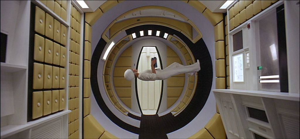
One of the most aesthetically "future proof" movies is probably 2001: A Space Odyssey. Compare Star Wars, released almost a decade later, and how the Stormtrooper armor looks dated (at least to me): http://i.imgur.com/sLhv0LJ.png
I dunno, whilst Kubrick deserves credit for giving his space explorers a proto-iPad, those gorgeous space station interiors[1][2][3][4] scream 1960s cutting-edge style in the way plastic bodysuits, or indeed the more functional interiors of the Death Star don't really say much about the seventies. I'd put the tacky appearance of the Stormtrooper armour down more to Lucas being less obsessive about detail than Kubrick.
Came here looking for this comment - I'm glad you agree. Most interfaces are a tiny bit laughable a few years later, but 2001 overall still feels current (in UI and just ... Everything). I also kinda liked the UIs in Alien(s) and Bladerunner, though they are clearly kinda dated
"Noessel posits that, because blue is so rare in nature there’s something fundamentally mystical, unnatural, and inhuman about it."
This is strange. First the ocean and the sky look blue. So regardless of whether they are, they are.
Second, there are blue flowers, blue birds, blue fish, blue eyes, blueberries, Kentucky Bluegrass, Blue Heelers, and Blue Tick Hounds. It doesn't seem more rare to me than red or yellow. Green is everywhere. But blue doesn't seem rare to me.
It is the second most common color in flags (behind red) for a reason.
it is the second most common color in logos for a reason.
What I love the most about that videophone sequence is the little girl asking for a phone for her birthday. Here we are, living in the future, and what do kids want for their birthdays? Phones.
That's a lot of analysis for something that some art directors just decided to go with because it looked good, or spring boarded from previous designs...
Nah, you don't want to automatically override safeties (this week it's 30 years since the Chernobyl disaster, hint hint).
What I was trying to say is that it makes sense to first set up a self-contained transaction, and then a single universal "button" to push it into the world, instead of firing off single commands, one at a time. (Especially at the latencies involved in cross-galaxy communication)
"Star Trek also may have helped create the entire image-under-glass paradigm that governs our digital world. The interface, known as LCARS, is cool-looking. It’s distinctive. And it’s actually the result of a budget shortfall.
Star Trek: The Next Generation didn’t have as much money for set design as did the original series, which had panels wired with jewels and glowing buttons. Instead, they cut out film and put them over glass panes."
It's usually constraints, not the lack of them, that give birth to true innovation.