You never want it to stand out, you just want everything to look balanced.
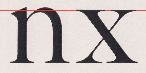
A slight amount of hanging looks like it's not hanging at all -- it just looks right. The same way the top and bottom of an 'O' are higher/lower than the top and bottom of an 'X', even though it doesn't look like it.
It's all about visual weight -- how the eye perceives it.
Fully hanging punctuation is just way overdoing it.
Try to follow that baseline with your eye. It's a roller coaster of chaos.
Type designers like to add overshoots merely out of habit, not aesthetics. They might have made sense in the lead type era, but simply look like mistakes today.
They're not hideous. Overshoots sage there because at normal reading sizes sizes, or on poster sizes read from far away, if letters like o, n, O, A, etc. don't have overshoots, then they'll look too small compared to the other letters, even though they're technically the same size. It's an illusion that type designers work around using letter overshoots.
Look at sequences of capital letters in Kabel a typeface which doesn’t use overshoots and you will see that you’ve been ignoring overshoots all over the place.
#/media/File:Kabel_new_specimen.png)
You never want it to stand out, you just want everything to look balanced.
A slight amount of hanging looks like it's not hanging at all -- it just looks right. The same way the top and bottom of an 'O' are higher/lower than the top and bottom of an 'X', even though it doesn't look like it.
It's all about visual weight -- how the eye perceives it.
Fully hanging punctuation is just way overdoing it.